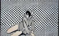
I visited the Design Museum to see the exhibition of the fashion drawing illustration.
“Drawing Fashion celebrates a unique collection of some of the most remarkable fashion illustrations from the twentieth and twenty first centuries. These original works define the fine art of illustrating fashion, from the collections of Chanel, Dior, Comme des Garçons and Poiret as well as Viktor & Rolf, Lacroix and McQueen.”
During my time in London I visited the Design Museum to see the exhibition of the fashion drawing illustration from over the last 100yrs.
The aim of the show is to show different fashion illustrations and how designers design and take their ideas into drawing to show you something that you have never seen. The main point of this exhibition was to show you how other designers work – how they work differently. I went to see how people draw and design.
The curator was Colin McDowell and he wanted to create a private collection. The exhibition consists of large rectangle cubes with light shining through them to make the illustrations stand out. The cubes and the white walls reflected the light. The lighting was very bright but felt ok. The lighting enhanced the drawings and made it easier for me to see them.
The cases and the illustrations were lined up at the same height, in the centre of the frames. They were laid out in a snake through the exhibition. The walls were white which made the illustrations stand out. The space was open and free so there was room to move around and get a good view of the detail.
You had to walk around the exhibition in a certain way. With the frames at the same level, you can see the detail clearly: the structure, fashion detail, colour, shape and silhouette. I liked the drawings of Antonio Lopez because he appealed to me the most with his use of style and the way he works. He has illustrated work by Oscar de la Renta and others.
Some examples were eye catching but some were simple. There was a variety of illustrations: some were simple but detailed too. He has different styles for different designers. The illustrations are well connected and they flowed effectively . It showed the process of idea development. It was a simple layout. There was a good mixture of styles of illustration so they were well chosen.
There was writing up for each illustration with each group of images. I didn’t read the text much because I was more interested in the illustrations. I might have read more if the information was digitally presented and interactive.
I liked this exhibition because it showed a range of illustration styles which were totally different from each other. Some were simple, some were really well composed, some were really technical.
People said that"It's a fantastic exhibition, beautiful curated in a great setting." and that "Getting to see the originals, being able to properly study them and look at their techniques (after seeing them in old Vogues and fashion history books) is massively inspiring." I agree with this.
References
http://designmuseum.org/exhibitions/2010/2010-drawing-fashion
http://designmuseumshop.com/exhibitions/previous/drawing-fashion/drawing-fashion-a-century-of-fashion-illustration
Reviews
http://www.wornthrough.com/2010/12/16/exhibition-review-drawing-fashion-at-the-design-museum/
http://www.dezeen.com/2010/11/18/drawing-fashion-at-the-design-museum-by-carmody-groarke/
http://thefashionscoutsept09.blogspot.com/2010/11/drawing-fashion-at-design-museum.html


